
Introduction
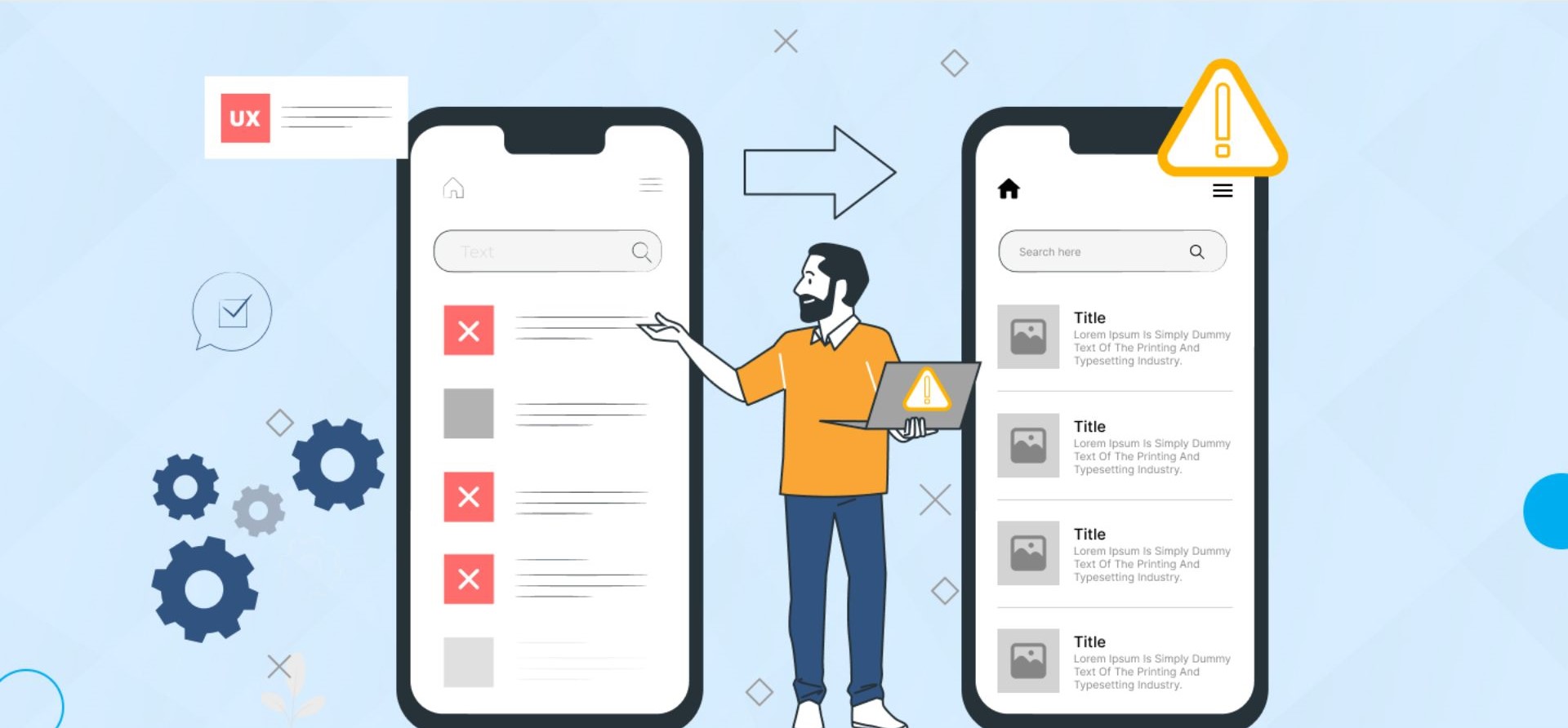
Running a successful e-commerce store goes far beyond listing products and driving traffic. If your website fails to deliver a smooth, intuitive experience, visitors won’t convert — no matter how great your products are.
Studies show that poor user experience (UX) is one of the leading causes of lost e-commerce sales. From confusing navigation to a clunky checkout process, small UX failures silently drain your revenue every single day.
In this guide, we’ll walk through the 7 most critical e-commerce UX mistakes and show you exactly how to fix them to boost conversions, build customer trust, and grow your revenue — with actionable tips backed by conversion optimization best practices.
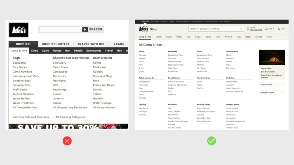
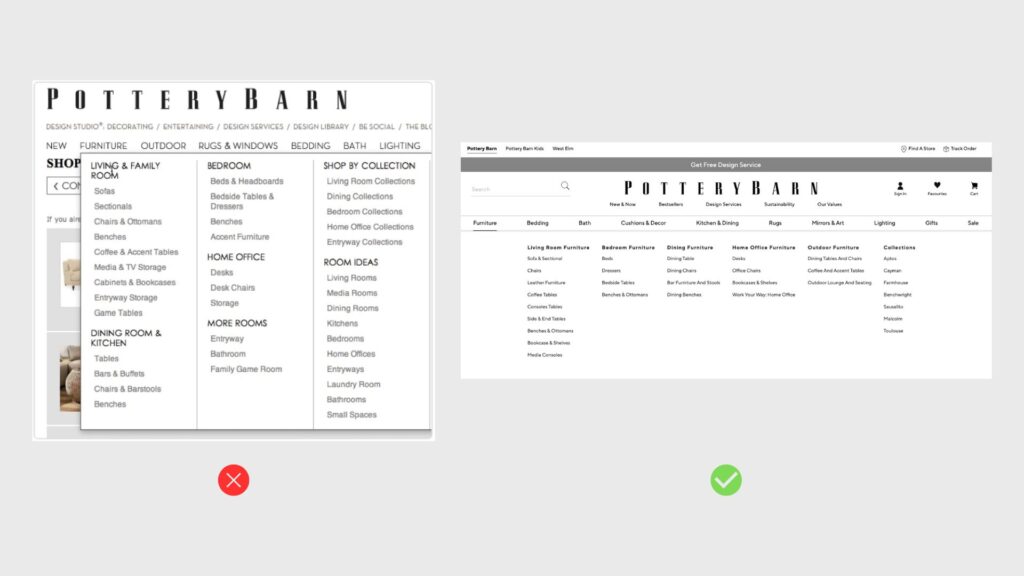
1. Complicated Navigation & Poor Product Discovery
If users can’t find what they’re looking for within seconds, they’ll leave — and your bounce rate will climb. Poor navigation is one of the most common (and most damaging) e-commerce UX mistakes.
Common issues:
- Too many or poorly labeled menu categories
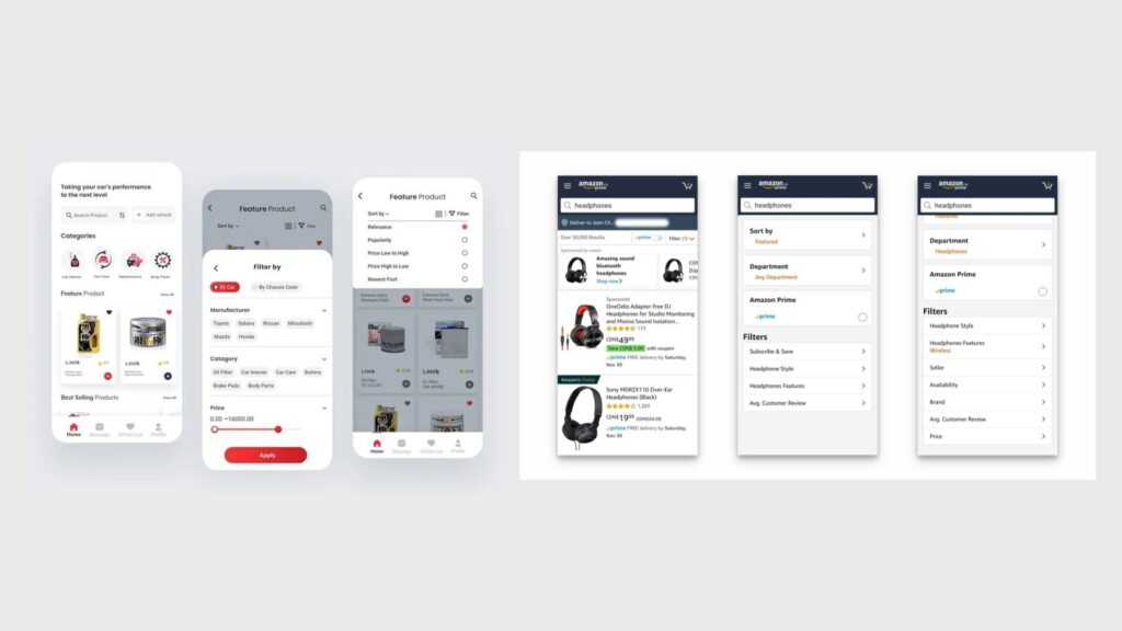
- No filters, sorting, or search functionality
- Non-intuitive category structures
How to fix it:
- Use clear, descriptive labels (e.g., “Men’s Running Shoes” instead of “Collection A”)
- Add smart filters by price, size, color, brand, and ratings
- Implement a prominent search bar with auto-complete suggestions
- Follow a logical category hierarchy with no more than 2–3 levels deep
Good navigation directly impacts SEO too — clear site structure helps search engines crawl and index your pages more effectively, improving your rankings for product discovery keywords.
2. Weak Product Page Design
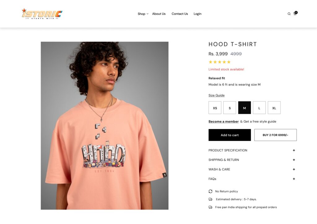
Your product page is where purchase decisions happen. A weak product page is one of the top reasons for low conversion rates in e-commerce.
Common issues:
- Low-quality or insufficient product images
- Vague or missing product descriptions
- Weak, buried, or unclear call-to-action buttons
How to fix it:
- Use high-resolution images with zoom functionality and multiple angles
- Include a short video or 360° view where possible
- Write detailed descriptions that cover specs, benefits, and use cases
- Make your CTA button prominent: “Add to Cart” or “Buy Now” above the fold
- Add social proof — star ratings, review counts, and “X people bought this today”
Well-optimized product pages also rank for long-tail keywords like “best for [use case],” making this a direct SEO win alongside its conversion benefits.
3. Slow Page Load Speed
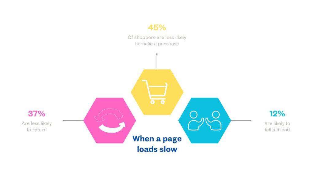
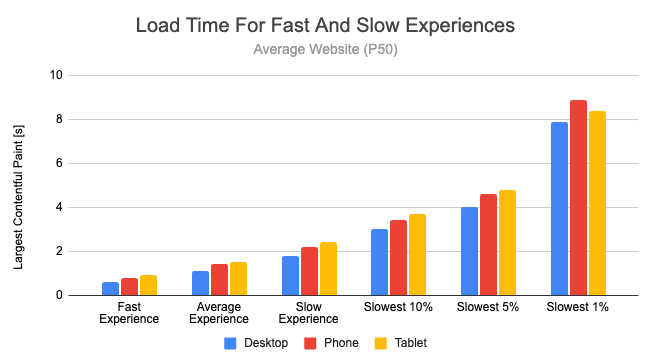
Page speed is both a UX issue and a direct Google ranking factor. Research by Google shows that even a 1-second delay in load time can reduce conversions by up to 7%.
Common causes:
- Uncompressed or oversized product images
- Too many third-party scripts and plugins
- Inadequate hosting infrastructure
How to fix it:
- Convert images to WebP format and compress without sacrificing quality
- Implement lazy loading so images only load when visible
- Minify CSS, JavaScript, and HTML
- Use a CDN (Content Delivery Network) to serve assets faster globally
- Regularly audit your Core Web Vitals in Google Search Console
Faster pages rank higher, reduce bounce rates, and keep shoppers engaged — making speed optimization one of the highest ROI fixes for any e-commerce store.
4. Complicated Checkout Process
Cart abandonment averages around 70% across e-commerce — and a complicated checkout is the single biggest driver. Every extra step, form field, or surprise cost gives users a reason to bail.
Common issues:
- Too many required form fields
- Forced account creation before purchase
- Hidden shipping costs or taxes revealed at the final step
How to fix it:
- Always offer a guest checkout option
- Reduce form fields to the absolute minimum required
- Display the full cost (including shipping and taxes) as early as possible
- Add a progress bar so users know how many steps remain
- Offer multiple payment options: credit card, PayPal, UPI, Buy Now Pay Later
A streamlined checkout directly reduces cart abandonment rates — one of the most impactful improvements you can make to your e-commerce conversion rate.
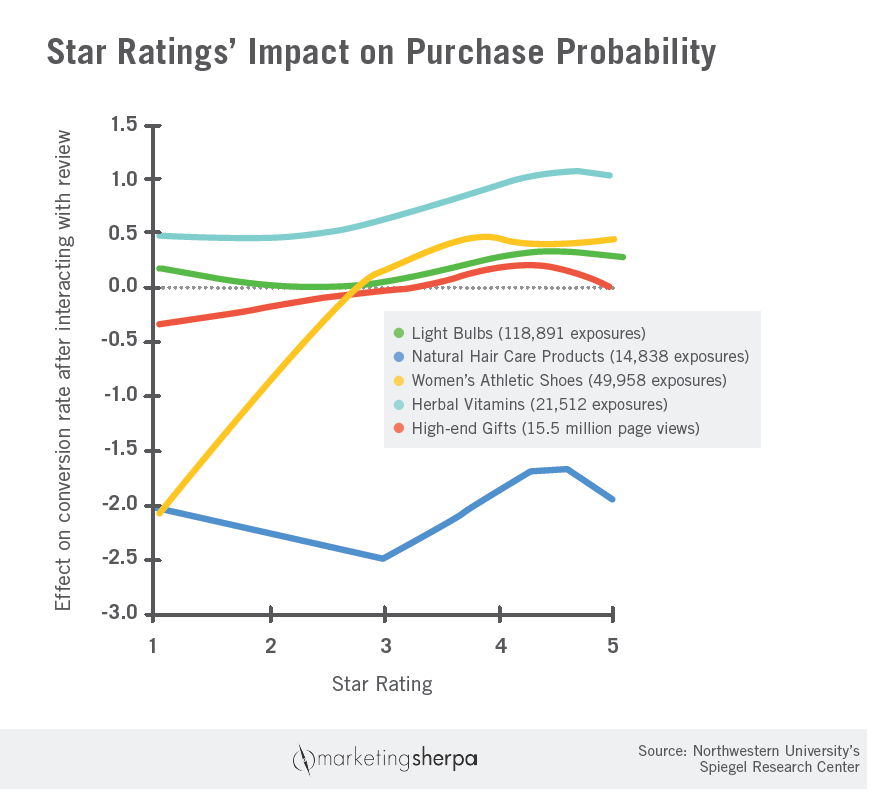
5. Missing Trust Signals
First-time visitors are naturally skeptical. Without visible trust signals, even interested shoppers will hesitate to enter their payment details.
Common missing elements:
- Customer reviews and star ratings
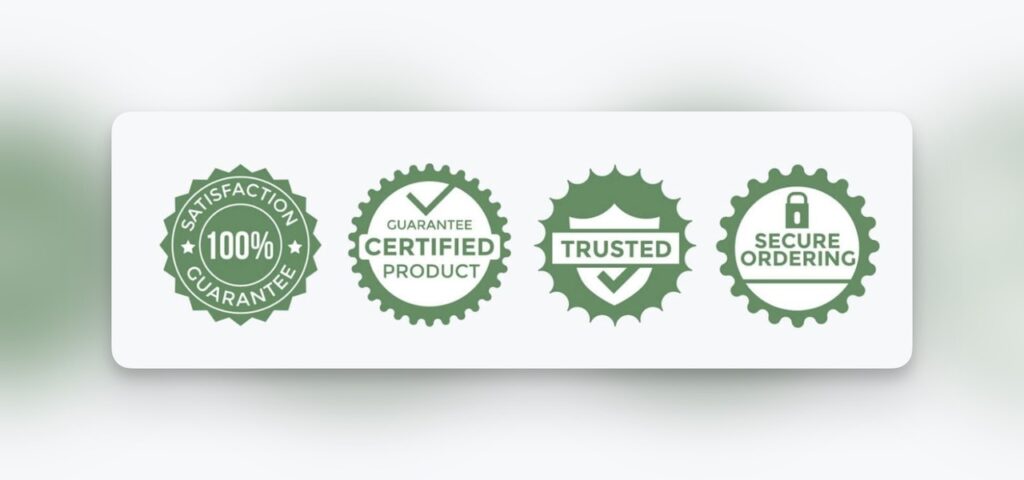
- Security badges and SSL certificates
- Clear, easy-to-find refund and return policies
How to fix it:
- Display customer reviews prominently on product pages and the homepage
- Show security icons at checkout (SSL, Visa Secure, Mastercard ID Check, etc.)
- Add a money-back guarantee badge where visible
- Link to your return and refund policy from the footer, product pages, and checkout
- Feature “As seen in” press mentions if applicable
Trust signals reduce friction in the final decision-making phase — directly increasing your e-commerce conversion rate and average order value.
6. Poor Mobile Shopping Experience
Over 60% of e-commerce traffic now comes from mobile devices — yet many stores still design for desktop first and treat mobile as an afterthought.
Common issues:
- Buttons too small to tap comfortably
- Text that requires zooming to read
- Broken layouts or elements that don’t resize properly
How to fix it:
- Adopt a mobile-first design approach from the start
- Ensure all buttons meet the recommended 44×44px minimum tap target size
- Use readable font sizes (minimum 16px for body text)
- Optimize images and layouts for smaller screens
- Test your store on multiple real devices, not just browser emulators
A poor mobile experience doesn’t just hurt conversions — Google’s mobile-first indexing means it directly impacts your search rankings too.
7. Vague or Poorly Placed Call-to-Actions (CTAs)
Even if users want to buy, a weak or confusing CTA can stop them in their tracks. Your calls-to-action guide users through the conversion funnel — and if they’re unclear, your funnel leaks.
Common issues:
- Generic copy like “Click Here” or “Submit”
- CTAs buried below the fold or hard to spot
- Low-contrast button colors that blend into the background
How to fix it:
- Use action-oriented, benefit-driven copy: “Add to Cart,” “Get Yours Now,” “Start Free Trial”
- Position primary CTAs above the fold on every key page
- Use high-contrast button colors that stand out from the page background
- Limit competing CTAs on a single page — one primary action, one secondary at most
- A/B test button copy, color, and placement regularly
Small CTA improvements can deliver outsized conversion gains without any changes to your product, price, or traffic strategy.
Conclusion
E-commerce success is built on experience, not just products. By addressing these seven UX mistakes — navigation, product pages, load speed, checkout flow, trust signals, mobile design, and CTAs — you create a store that converts visitors into customers and customers into repeat buyers.
Start with your biggest pain point. Run a quick UX audit using tools like Hotjar (heatmaps), Google PageSpeed Insights (speed), and Google Analytics (funnel drop-offs) to identify where you’re losing the most customers right now. Even fixing one of these issues can produce a measurable lift in conversions.
💡 At uxful.in, we design conversion-focused e-commerce experiences that turn visitors into customers.👉 Ready to improve your store? Get a Free UX Audit at uxful.in